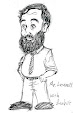
I'm in the doldrums with my pop art. I've been Kandinskying things - almost all my pop art over the last couple years has been Kandinskyed (sp?) photos - and it hasn't really run its course. I produce one for the Quakers every week. I produce book covers. That's about the run of my pop art these days.
On the topic of book covers, I've had trouble, actually, getting the inspiration to remake all the ones that need to be remade. I've remade a few - Kandinskyed, in most cases - but have a dozen to redo. I've had a few ideas but I'm having fewer hours to click together to pull them together.
Furthermore, I'm not happy about my pop gallerie, which doesn't really display the pop art the way I want it displayed. And, I don't have much time to redo it although I've had plenty of chances.
Life is just so bizarre. I'm going to take my phone out, and try to record more of it.
Wednesday, May 18, 2022

Tuesday, October 19, 2021
Book Covers
A book cover can and should be a work of good pop art, put out into the world, published enjoyed by people. While you read a book, whether it takes you a day or a week, you have it out in your life, on the chair or bed, for everyone to see. It should grab their eyes and make an impression. I work on that. Some of mine are clearly better than others.
I am about to go through all my book covers and redo the ones I can. When I do, I will put my best pop art on them. In a general sense my goal is to use the best of pop art so that, of my thirty times two or so of covers, all are my best work. There are a few complications.
In general, since almost all my books are 6 X 9, all my covers are about that size. The biggest complication is that choosing to put the art on there without the title, subtitle, and author's name (because after all you can put that on the spine), is, I think, taking a chance. I have done that but have not been happy with the appearance. One author asked me why I left my own name off of Pile of Leaves: Stories of a Rake since I was the rake in question, and I had to admit, it was really for pop design reasons but not anything I'd really thought through carefully. I have one book, Comin' 'Round to Lovin' It, which even at this moment has no words on its title, although probably it should, and it even has a cool subtitle (23 short stories out of 99 billion served) which gives people a little chuckle. I have now swung around the other way to decide that books should have all three, title, subtitle, and author, on the cover, if at all possible, with whatever you put on the spine as a kind of bonus, which helps it when it's in its shelf, tucked away, not being read.
The question, then, to me, is, should the design lead your eyes to the words? Or should it whack you in the face and make you read the words separately? Does it help if the words are last (bottom right if possible) - or is it better if you get the words, or some of them, before you even look at the picture? Are smaller fonts more annoying in terms of interfering with the impression of the art, because you can't read them without effort? My questions here have more to do with strategy. I have a lot of covers to redo, and my last question is this: Do I need an overall brand/look to tie all thirty of them together? Or is it ok to have outlliers that really don't look like the rest?
I am about to go through all my book covers and redo the ones I can. When I do, I will put my best pop art on them. In a general sense my goal is to use the best of pop art so that, of my thirty times two or so of covers, all are my best work. There are a few complications.
In general, since almost all my books are 6 X 9, all my covers are about that size. The biggest complication is that choosing to put the art on there without the title, subtitle, and author's name (because after all you can put that on the spine), is, I think, taking a chance. I have done that but have not been happy with the appearance. One author asked me why I left my own name off of Pile of Leaves: Stories of a Rake since I was the rake in question, and I had to admit, it was really for pop design reasons but not anything I'd really thought through carefully. I have one book, Comin' 'Round to Lovin' It, which even at this moment has no words on its title, although probably it should, and it even has a cool subtitle (23 short stories out of 99 billion served) which gives people a little chuckle. I have now swung around the other way to decide that books should have all three, title, subtitle, and author, on the cover, if at all possible, with whatever you put on the spine as a kind of bonus, which helps it when it's in its shelf, tucked away, not being read.
The question, then, to me, is, should the design lead your eyes to the words? Or should it whack you in the face and make you read the words separately? Does it help if the words are last (bottom right if possible) - or is it better if you get the words, or some of them, before you even look at the picture? Are smaller fonts more annoying in terms of interfering with the impression of the art, because you can't read them without effort? My questions here have more to do with strategy. I have a lot of covers to redo, and my last question is this: Do I need an overall brand/look to tie all thirty of them together? Or is it ok to have outlliers that really don't look like the rest?
Saturday, September 18, 2021

Sunday, June 27, 2021

Saturday, May 15, 2021
Twitter era
I kind of feel like I'm in a new era with pop art. I've been doing pop art for a long time, mostly for fun, having trouble keeping up the blogs like the gallerie. So I have a kind of sloppy appearance (not happy with that blog) but am at least creating and producing.
But now it's the twitter era, and I've stepped up my game. I need lots of good pop art to dump on Twitter even though it's kind of an infinite hole. I've got my groove with the writer's community and, though they don't see everything I put there, at least I have plenty of it.
And, I've kept it coming. Come visit @ramblintom - it's me.
What happens is, there are a lot of writer's lifts. Everyone piles on with their book promos, me included. I get in one or two of them a day. I try to vary my presentation thus need a lot of pop art. It's actually fun. It doesn't work, in the sense of getting people to read my books. But it's fun cranking them out and putting them up there.
Someday I'll make an exhibit...
But now it's the twitter era, and I've stepped up my game. I need lots of good pop art to dump on Twitter even though it's kind of an infinite hole. I've got my groove with the writer's community and, though they don't see everything I put there, at least I have plenty of it.
And, I've kept it coming. Come visit @ramblintom - it's me.
What happens is, there are a lot of writer's lifts. Everyone piles on with their book promos, me included. I get in one or two of them a day. I try to vary my presentation thus need a lot of pop art. It's actually fun. It doesn't work, in the sense of getting people to read my books. But it's fun cranking them out and putting them up there.
Someday I'll make an exhibit...
Sunday, November 15, 2020

Saturday, November 14, 2020
Pop book
This page deals with my identity as a pop artist. I have been a pop artist for a long time, as you can see from the xerox-art pop productions in the post below this, but I am coming to a point where I'm beginning to think about that identity and wonder if I should do anything about it.
The present phase has lasted about a year, and could be described as Kandiskian impressionism. I have been taking pictures of mountain roads, and altering them in an impressionistic way, and I've been doing this mostly for the purpose of promoting Cloud Quakers. To see some of these Kandiskian impressionistic photos, go here and you'll get a kind of gallery of Quaker promotional pop.
But it's the big picture I've been mulling over. There was a posterization phase which was quite extensive (it's called cartoon on my present photo-altering program) and there have been other phases. In a time when I am changing computers, getting out of this one and putting things in another one, and in my wife's dropbox, it is time to do an overview.
And that brings up the possibility of a pop book. It is said that I should use Lulu for this, but I'm not sure if this would be best. I am also mulling over what shape it should be, or whether I even should do it.
Just to tell a quick story: My father was an excellent photogrpaher. He went through phases where he tried to sell iit, I've been told, but when I pushed him on the issue he was very ambivalent. I'll make you a book, I told him before he died. You should have a book of photography. Actually I still feel this way: he should have a book. Someone should document his incredible career in putting reality into beautiful design. ANd now, I seem to have inherited his life work - not so much a box of slides, but just an image, in my head, of his design ability and how it should be played out in book form. It's in my head; all the work is yet to be done. But I haven't done it. Why? Because of his ambivalence. It might be that he really didn't want fame or even a reputation as a photographer. And, as I satand on that cusp, I'm working on the same questions. Is it worth the work for something I'm ambivalent about getting in the first place?
I see now that on the #popart hashtag, Andy Warhol is back. Somebody is putting three or four posts a day on there, Marilyn, everything he does. They are reminding us, basically, that Warhol is still selling like cupcakes so to speak, and you can still buy as much as you want. Warhol in fact is the belwether (sp?) of the entire art world, I've heard, because he was so prolific and because his work fetches consistently good prices every time it becomes available. OK so I'm not a Warhol yet. But the only other person on that hashtag is Rauschenberg (actively promoting himself) and the market is wide open. I could do it; I could put my own pop up there. All that remains is fro me to do the work.
The present phase has lasted about a year, and could be described as Kandiskian impressionism. I have been taking pictures of mountain roads, and altering them in an impressionistic way, and I've been doing this mostly for the purpose of promoting Cloud Quakers. To see some of these Kandiskian impressionistic photos, go here and you'll get a kind of gallery of Quaker promotional pop.
But it's the big picture I've been mulling over. There was a posterization phase which was quite extensive (it's called cartoon on my present photo-altering program) and there have been other phases. In a time when I am changing computers, getting out of this one and putting things in another one, and in my wife's dropbox, it is time to do an overview.
And that brings up the possibility of a pop book. It is said that I should use Lulu for this, but I'm not sure if this would be best. I am also mulling over what shape it should be, or whether I even should do it.
Just to tell a quick story: My father was an excellent photogrpaher. He went through phases where he tried to sell iit, I've been told, but when I pushed him on the issue he was very ambivalent. I'll make you a book, I told him before he died. You should have a book of photography. Actually I still feel this way: he should have a book. Someone should document his incredible career in putting reality into beautiful design. ANd now, I seem to have inherited his life work - not so much a box of slides, but just an image, in my head, of his design ability and how it should be played out in book form. It's in my head; all the work is yet to be done. But I haven't done it. Why? Because of his ambivalence. It might be that he really didn't want fame or even a reputation as a photographer. And, as I satand on that cusp, I'm working on the same questions. Is it worth the work for something I'm ambivalent about getting in the first place?
I see now that on the #popart hashtag, Andy Warhol is back. Somebody is putting three or four posts a day on there, Marilyn, everything he does. They are reminding us, basically, that Warhol is still selling like cupcakes so to speak, and you can still buy as much as you want. Warhol in fact is the belwether (sp?) of the entire art world, I've heard, because he was so prolific and because his work fetches consistently good prices every time it becomes available. OK so I'm not a Warhol yet. But the only other person on that hashtag is Rauschenberg (actively promoting himself) and the market is wide open. I could do it; I could put my own pop up there. All that remains is fro me to do the work.
Subscribe to:
Posts (Atom)